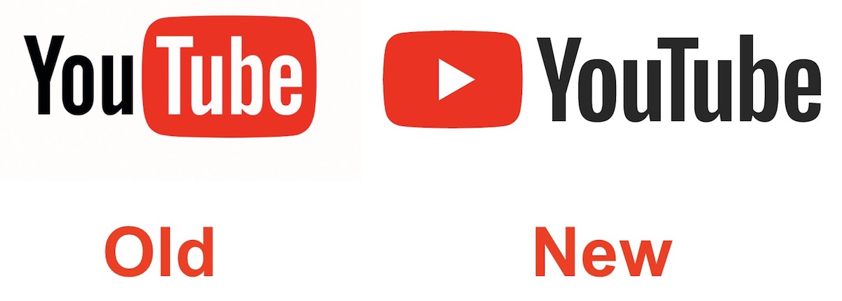
Designed for our multi-screen world, the updated Logo combines a cleaned up version of the YouTube wordmark and Icon, creating a more flexible design that works better across a variety of devices, even on the tiniest screens.

As with its logo change, several new YouTube features will be made available for all users:
Mobile app screens will now have less black bars as the video screen will adapt to the shape of video content you’re streaming — be it square, vertical, or horizontal
New app functionalities: A double tap on the left or right side of the video screen will now let you rewind or forward videos, and users can now control the pace of videos they’re watching by speeding up or slowing down
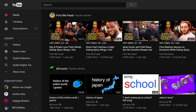
Unveiling a brand new look — the desktop version finally adapts more to Google’s Material Design standards (and Dark Mode, finally!) which the company has been testing for quite some time
Browse videos as you watch with a new setup where related clips are shown at the bottom row while you watch


